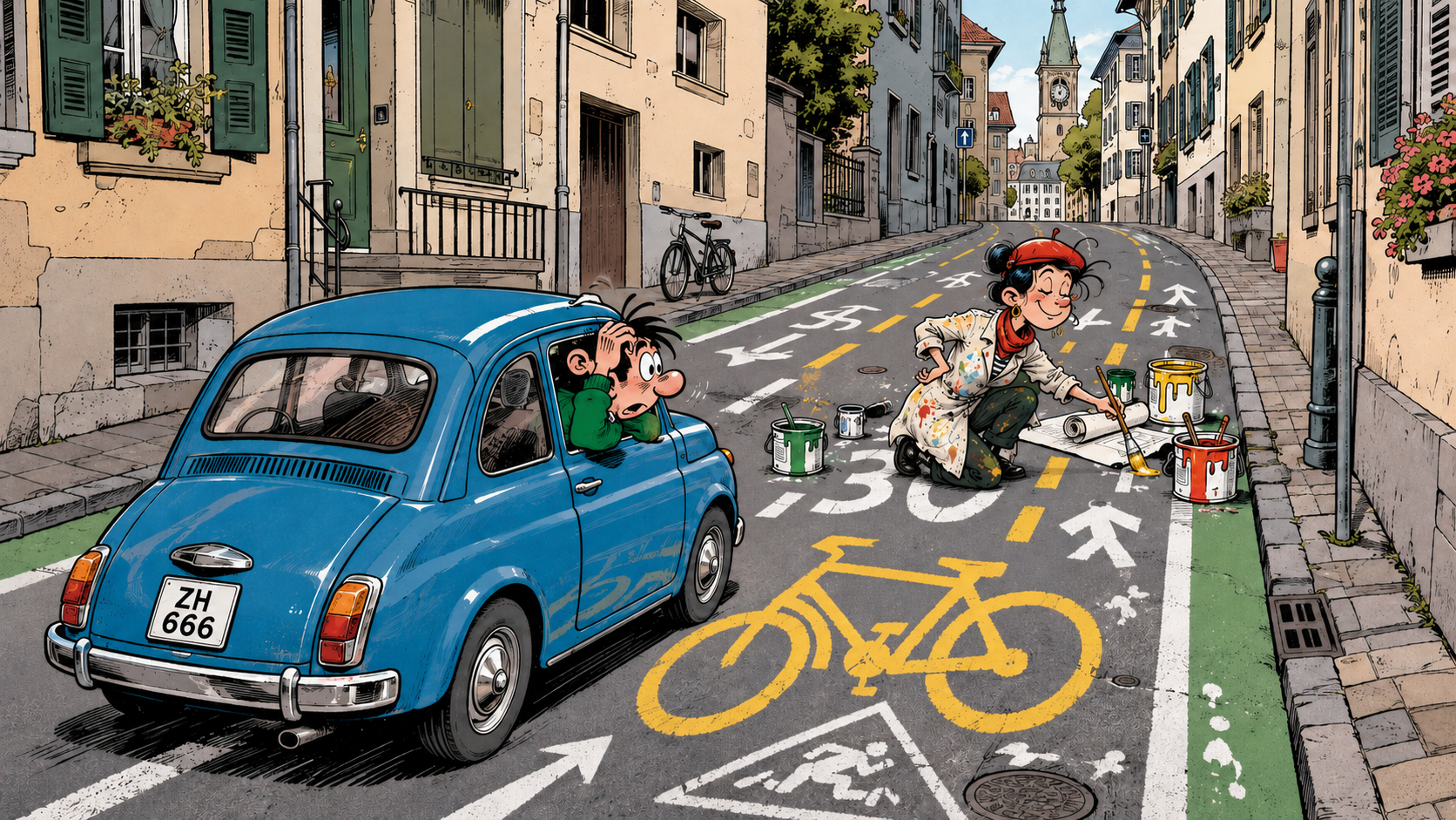
Road markings used to tell you what to do. Zürich has improved on this by making them tell you what the city thinks. A particular stretch of road is merely one fine specimen from Zürich’s growing collection of traffic-design curiosities: green strips along both sides, a dashed yellow line, a large “30”… and then there is the enormous yellow bicycle. Despite occupying half the street, it gives cyclists no special rights and creates no special priority. Where priority applies, that is regulated separately by the normal traffic signs and markings.
So on this straight piece of road, the giant bicycle changes precisely nothing. Cars may drive here. Bicycles may drive here. Nobody has to move aside, give way or behave differently because Zürich has painted a bicycle the size of a tennis court onto the asphalt. So what does it actually tell us?
It does not bother with subtlety. It screams:
BICYCLES ARE IMPORTANT HERE.
Thank you, Zürich. We had somehow missed that. 🤦
Finding a street in Zürich where bicycles are not important would probably be the greater challenge. Painting one the size of a tennis court onto the road therefore has roughly the informational value of writing WATER next to Lake Zürich.
The green strips are even better. According to the city, they are there for “orientation”. Orientation towards what? The direction of the road? Have we really become so helpless that without two green lines following the street we might suddenly lose our bearings, turn ninety degrees, mount the pavement and continue through a pharmacy? And despite looking wonderfully official, the green strips have no actual traffic-law meaning. The rather less spectacular dashed yellow line next to them does.
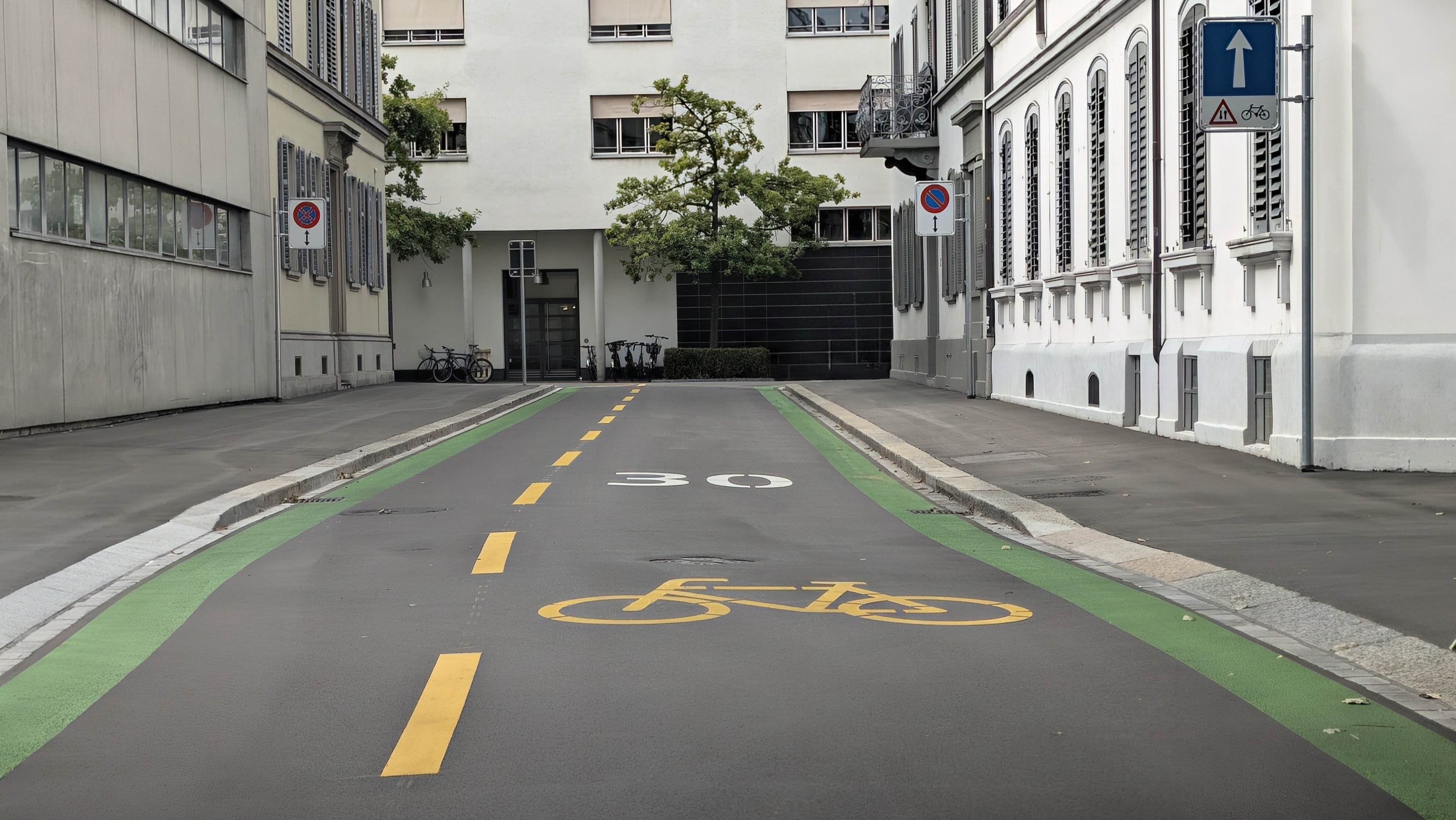
Which brings us to the real problem. Zürich keeps adding colours, symbols, pictograms and “orientation aids” in the apparent belief that more information automatically creates more clarity. It does not. At some point the road stops informing people and starts confusing them. The driver now has to decide which marking is legally relevant, which is merely helpful, which is decorative, which indicates a route, which indicates a lane and why a bicycle the size of Luxembourg has suddenly appeared underneath the car.
This is not traffic guidance. It is urban planning with an art-school complex. Of course, every individual element can be explained. Somewhere there will be an excellent PDF proving that all of this is perfectly sensible. Unfortunately, traffic participants tend to drive through Zürich without first studying the supporting documentation.
If your attempt to make a street safer leaves people wondering what half the things painted on it actually mean, perhaps adding more paint is not the cleverest next step.
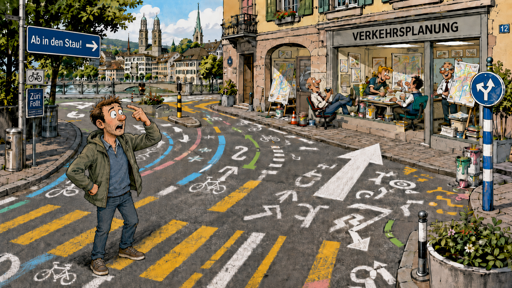
At some point the appropriate road marking may simply be a large arrow pointing towards Zürich’s traffic planners. Preferably accompanied by a finger rotating gently beside the head.
Just my five cents.
//Alex

